
Renovating a bedroom starts with one of the most powerful choices you’ll make: paint color. Designers remind us that color doesn’t only change the look of a room—it shapes how you feel in it. Bedrooms should calm, restore, and ease you into rest. The wrong shade can do the opposite, leaving you restless instead of rejuvenated.
Thank you for reading this post, don't forget to subscribe!With more South Africans pouring energy and money into home makeovers, it pays to know which colors don’t belong in a restful space. In Gauteng, where hectic city life collides with suburban escapes, your bedroom must work as a stress antidote, not an extension of the chaos.
We spoke with design professionals and dug into color psychology research to highlight the five paint colors you should avoid in your bedroom—and why.
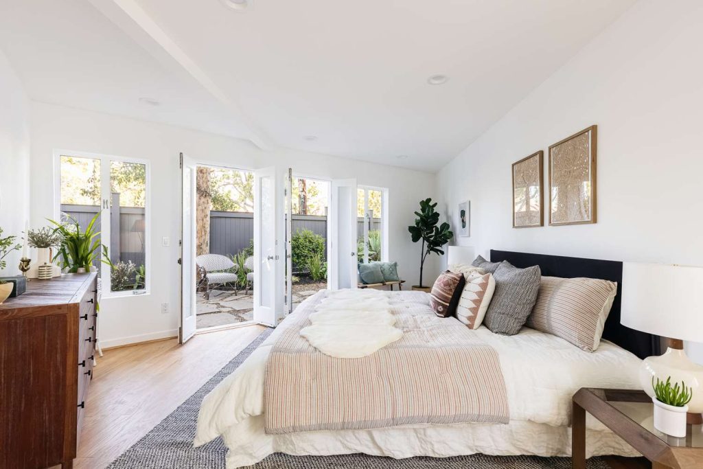
1. Stark White – Too Cold for Comfort
White may look classic, but harsh, cool whites often drain warmth from a room. Under artificial light, they can feel more like hospital walls than a sanctuary.
Bailey Li, owner of Bailey Li Interiors, says:
“Cool whites don’t carry the coziness you need for rest. They strip a bedroom of personality and comfort.”
If you love white, Gauteng designers suggest warmer off-whites or cream tones. These shades bounce natural light beautifully and keep the space soft and welcoming.
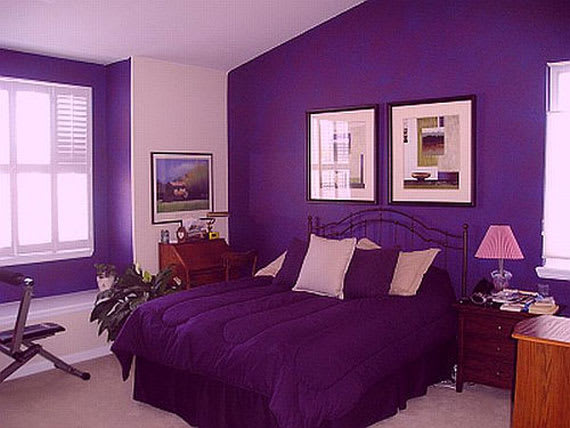
2. Bright Purple – Energizing, Not Relaxing
Purple carries royal weight, but bright versions are too stimulating for rest.
Andrea Magno, director of color marketing at Benjamin Moore, explains:
“Hot, saturated purples sit on the energizing side of the color wheel. They wake the eye instead of relaxing it.”
For calmer energy, lean toward muted mauve or dusky lavender. Gauteng homeowners often add rich purple in accents—pillows, throws, or artwork—without letting it dominate the space.
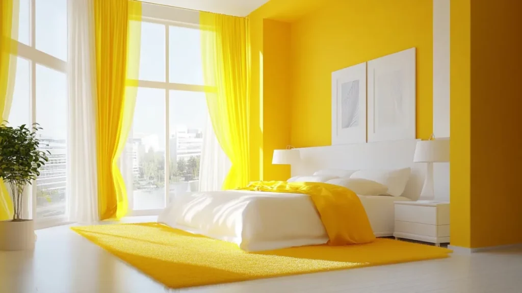
3. Yellow – Sunshine That Interrupts Sleep
Yellow feels cheerful, but in bedrooms, it tricks your brain into thinking it’s daylight. That stimulation makes winding down at night harder.
Magno warns:
“Bright yellow is better for kitchens or bathrooms. In bedrooms, it overstimulates and fights against rest.”
If yellow inspires you, use softer buttery tones or add it sparingly in décor—a sunflower pillow or ochre headboard adds optimism without overpowering the room.
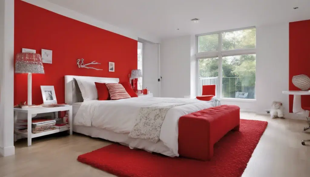
4. Red – Stimulation Overload
Red commands attention, but it also raises energy levels and even blood pressure. Bright red walls may keep your mind buzzing long after you switch off the lights.
Li cautions:
“Red is powerful, but too much of it overstimulates. Bedrooms need balance, not constant energy.”
Instead, Gauteng designers point to earthy terracotta or soft blush tones. Use red strategically—a lamp base, rug, or accent table—without flooding the room with it.
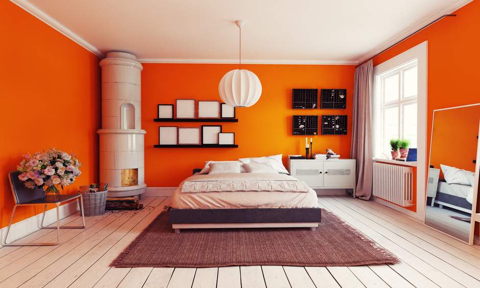
5. Orange – Too Playful for Rest
Orange is lively and fun, but it doesn’t belong on bedroom walls.
Mary Patton, interior designer, puts it bluntly:
“Bright orange belongs in energetic spaces, not bedrooms. Bedrooms should soothe, and orange pushes stimulation.”
The one exception? Terracotta, a red-orange mix, grounds a room while keeping warmth. In Gauteng homes, terracotta works well as an accent wall or decorative element. For most walls, soft neutrals, blues, or greys create far more calming backdrops.
Black and Dark Gray – Dramatic, But Heavy
Pinterest loves moody black bedrooms, but in reality, they often feel suffocating. Andrea Magno suggests layering instead of painting every wall dark:
“Mix darker and lighter shades in the same family. It adds depth without overwhelming.”
A charcoal feature wall paired with warm greys or taupe gives sophistication without turning the space into a cave.
Why This Matters in Your Bedrooms
Life in Gauteng is fast. Bedrooms here aren’t just for sleep—they’re sanctuaries from long commutes, buzzing traffic, and packed schedules. Get the paint wrong, and your sanctuary becomes another source of stress.
Designers argue the right palette doesn’t just improve style—it impacts health. Balanced, calming colors help you sleep better, lower stress, and even improve harmony at home.
Make Color Work for You
Heritage and taste shape your choices, but design expertise shows some shades simply fight against rest. Before repainting this season, consider how your walls influence your nights—not just your Instagram feed.
This Heritage Month, invest in your bedroom as a true sanctuary.
- Audit your space: Does your color scheme relax or agitate you?
- Be strategic: Keep bold shades for accents, not walls.
- Go local: Visit Gauteng paint shops or consult interior designers for advice on soothing palettes.
- Value rest: Treat your paint choice as part of your wellness plan—not just décor.
Because the most beautiful bedroom isn’t the trendiest—it’s the one that lets you switch off, recharge, and wake ready for Gauteng’s pace.